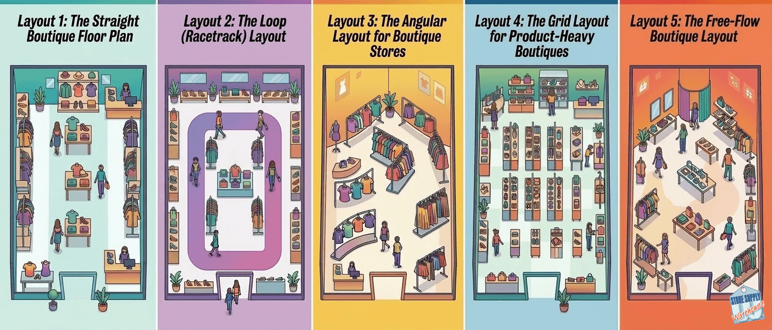
5 Boutique Floor Plan Layouts That Maximize Small Spaces
When you run a boutique under 1,000 square feet, every inch of floor space counts. The wrong floor plan can make a store feel cramped, hide your top sellers, and send shoppers straight back out the door. The right one draws customers through the space, puts products within reach, and makes a small footprint feel intentional.
In this post, we break down five proven boutique floor plan layouts for tight spaces. Whether you are setting up a new location or rethinking your current setup, these strategies pair smart fixture placement with practical tips you can act on today. Store Supply Warehouse has helped independent retailers outfit their stores for over 30 years, and these layouts reflect what actually works on the sales floor.
Why Your Boutique Floor Plan Matters More Than Square Footage
A 600-square-foot store with a strong layout can outsell a 1,200-square-foot store with a cluttered one. Your floor plan controls how customers move, what they see first, and how long they stay. It also determines how many products you can display without overwhelming shoppers.
The goal is to create a clear path that guides customers past your highest-margin items while leaving enough breathing room to browse comfortably. The five layouts below each accomplish this differently, depending on your store shape, product mix, and foot traffic patterns.
Layout 1: The Straight Boutique Floor Plan
This is the simplest layout and a strong starting point for narrow or rectangular spaces. Place your fixtures along the left and right walls with a clear aisle running from the entrance to the back of the store.
Use wall-mounted slatwall panels or a slotted standard system kit with shelves and brackets along both sides. These wall systems let you display merchandise vertically without eating into your floor space. Place a focal display or feature table at the back wall to pull customers deeper into the store.
At the front, keep a small table or low-profile display with new arrivals or seasonal items. Your checkout counter sits near the entrance so you can greet shoppers and keep an eye on the sales floor.
- Works well in stores that are long and narrow (10 to 15 feet wide)
- Keeps the center aisle open for easy movement
- Wall-mounted fixtures do the heavy lifting for product display
- Simple to set up and rearrange when seasons change
Layout 2: The Loop (Racetrack) Layout
The loop layout creates a defined path that takes customers on a circuit around the store. You place fixtures and displays along the outer walls and a center island or two in the middle, leaving a continuous walkway between them.
This layout works especially well for boutiques that carry a mix of clothing, accessories, and gifts. Use a collapsible round clothing rack or a 4-way clothing rack in the center to create browsing stations along the path. Along the walls, gridwall panels or slatwall panels give you vertical display space for hanging items, shelved products, or signage.
The loop naturally exposes shoppers to more of your inventory because they follow a set route rather than darting in and out of aisles.
- Increases the amount of merchandise customers see
- Center fixtures create natural stopping points
- Easy to direct customer flow with strategic rack placement
- Ideal for square or nearly square floor plans
Layout 3: The Angular Layout for Boutique Stores
An angular layout uses curved or angled fixture placement instead of straight rows. This creates a more curated feel and works well for boutiques that carry fewer items at higher price points.
Instead of lining racks up parallel to the walls, angle your 4-way racks and display tables at 45 degrees to the entrance. This opens up sightlines and gives the store a sense of movement. Use a full vision display case near the checkout to hold smaller, high-value items like jewelry or accessories.
The angular approach also makes it easier to create distinct product zones. For instance, angle one rack grouping toward the left with women's tops and another toward the right with bottoms and skirts. Customers can see multiple zones at once from the entrance, which draws them in.
Layout 4: The Grid Layout for Product-Heavy Boutiques
If your boutique carries a large number of SKUs, like a gift shop or accessories store, a modified grid layout lets you pack more product into a small space without feeling chaotic.
Use short runs of gondola shelving to create parallel aisles, similar to what you see in convenience stores but on a smaller scale. A starter economy aisle gondola unit assembles by hand in under an hour and can be merchandised on both sides.
Pair the gondola runs with wall-mounted displays on your perimeter walls. Slatwall panels with hooks and shelves work well here for hanging merchandise, boxed goods, or packaged items. Leave enough aisle width (at least 36 inches) for comfortable browsing, and wider near the entrance.
- Maximizes product density in small footprints
- Gondola shelving adjusts to fit different product sizes
- Low fixtures maintain open sightlines across the store
- Strong choice for stores with 200+ SKUs
Layout 5: The Free-Flow Boutique Layout
The free-flow layout has no set traffic pattern. Instead, you place fixtures, tables, and racks in a way that feels organic and invites exploration. This is common in high-end boutiques and curated shops where the experience matters as much as the product.
Use a mix of fixture types to create visual variety: a round garment rack here, a display table there, a glossy mannequin near the window, and a low shelf unit creating a soft boundary between sections. The lack of rigid rows encourages customers to wander and discover.
The trade-off is that free-flow layouts require more thought to get right. Without clear pathways, it is easy to create dead zones where customers do not go. Keep your highest-margin products near the entrance and in the center of the store where foot traffic naturally concentrates.
- Creates a relaxed, curated shopping experience
- Allows for creative fixture combinations
- Requires careful planning to avoid dead zones
- Works well when you rotate displays frequently
Tips for Choosing the Right Boutique Floor Plan
Start by measuring your floor space and sketching a rough outline. Note where your entrance, checkout, fitting rooms (if any), and storage areas are. Then consider your product mix. A clothing-focused boutique will lean toward loop or angular layouts that highlight garment racks and wall displays. A gift shop or accessories store may benefit from a grid or free-flow approach that accommodates more SKUs on shelving.
No matter which layout you choose, keep a few rules in mind. Place your strongest visual merchandising near the entrance and in the back-right area of the store, where research shows most right-handed shoppers look first. Keep aisles wide enough for comfort. And use your wall space aggressively with slatwall, gridwall, or slotted standards so your floor stays open.
Put Your Boutique Floor Plan into Action
A smart floor plan turns a small space into a store that feels bigger, shows off more product, and keeps customers browsing longer. Whether you go with a simple straight layout or a creative free-flow design, the right fixtures make the plan work.
Browse clothing racks, slatwall panels, gondola shelving, display cases & more to find the pieces that fit your layout and your budget.